Final Logo Design
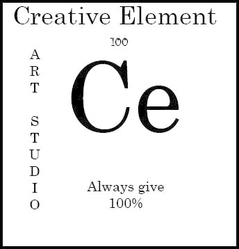
For my final I had to create a logo for an are studio called Creative Element. So I made it look like an element. I added the always give 100%. I like how it turned out, I think I could've gotten a little more creative with it, but still. I think it is very memorable. It's versatile and timeless, its also very simple.
Adds
Logos
For this project we made logos, it took quite a bit of time, because we had to take many things into consideration. We had to make them versatile, timeless, memorable, simple, and appropriate. We also had to take size into consideration, because these adds had to be able to go in the news paper as well. I think mt favorite logo was the Suicide Prevention one, because I took lots of time to do that one, and it turned out good. My least favorite was the music notes, because I didn't take as much time, ad they didn't look like they were done well. Also to answer one of you'er questions the red and green was supposed to be stop and go, but now thinking back on it, it didn't make much since.
Typeography
For this project we used many different tools such as envelope distort and the pen tool. Then added many effects. We learned how different font and designs pull more interest to different ages.
Photoshop Project.
In these we worked with photo shop tools. In the soccer one I added two things (the ball and gloves) and deleted one thing (the cup and the finger.) . Then I used name, because it's the best way to explain me i'm Bethany.
Pen Tool Practice
In this project I learned how to use Illustrator. There was many different tools I had to use, and some of them got a little confusing. I got aggravated a lot, but in the end it turned out better than I though it would. For my practice I did a thing saying were all mad here from Alice and wonderland, so I drew it out on paper then exported it into the computer and computerized it.
